
TABLE OF CONTENTS
You can see the final result on GitHub along with how to test the extension here.
See the Extension Features
Introduction
After I failed to build the Chrome Extension with Nextjs, I looked towards React.
Thanks to this article, I got an amazing headstart by cloning the provided GitHub template.

As a huge fan of Tailwind, I had to start by installing Tailwind CSS for Vite.
To use the Chrome API peacefully with typescript, install the types:
npm install --save-dev @types/chrome
Simple URL Shortener via Bitly in Chrome Extension
Step 1: Display Current Tab Url
With the help of ChatGPT & the extension docs, I could set up the extension to display the current tab URL. I'm keeping it very simple for now.
View <App/> - app.tsx
import './App.css'
import { useEffect, useState } from 'react';

function App() {
  const [currentUrl, setCurrentUrl] = useState('');

  async function getCurrentTabUrl() {
    let queryOptions = { active: true, lastFocusedWindow: true };
    // `tab` will either be a `tabs.Tab` instance or `undefined`.
    let tabs = await chrome.tabs.query(queryOptions);
    return tabs[0]?.url ?? "";
  }
  useEffect(() => {
    const fetchUrl = async () => {
      const url = await getCurrentTabUrl(); // Fetch the current tab URL
      setCurrentUrl(url);
    };

    fetchUrl();
  }, []);

  return (
    <div className='text-blue-500'>
      <h1>Current Tab URL</h1>
      <p>{currentUrl}</p>
    </div>
  );
}

export default App;
Step 2: Retrieve Short Link for Current Tab Using Bitly's API
Retrieve an access token from our bitly account.
Note: You should create a test account to avoid hitting limits on your main account.
Although this is insecure. For the sake of practice & simplicity, I'll use the manifest file to store and access the token.
{
    "manifest_version": 3,
    "name": "React Chrome Extension",
    "version": "1.0.0",
    "description": "A simple React app as a Chrome extension",
    "action": {
      "default_popup": "index.html"
    },
    "permissions": ["tabs"],
    // Add Your Bitly Access Token Here
    "bitly_access_token": "<your-token>"
  }
Use this function to retrieve the token:
function getToken() {
  const manifestData = chrome.runtime.getManifest();
  const bitlyAccessToken = manifestData.bitly_access_token;
  console.log("Bitly Access Token:", bitlyAccessToken);
}
Then call it in the main
App Component.Right-click on the extension and you will be able to access the PopUp's Devtools by clicking
inspect.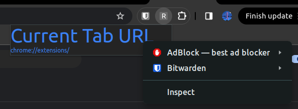
You should see your Bitly Access Token logged in the Console:

Step 3: Add a Button to Shorten the URL
We'll use this View function
function to shorten the URL via Bitly's API:View function shortenUrl() - app.tsx.
const shortenUrl = async (longUrl: string) => {
  const manifestData = chrome.runtime.getManifest();
  const token = manifestData.bitly_access_token;

  const response = await fetch('https://api-ssl.bitly.com/v4/shorten', {
    method: 'POST',
    headers: {
      'Authorization': `Bearer ${token}`,
      'Content-Type': 'application/json'
    },
    body: JSON.stringify({
      long_url: longUrl
    })
  });

  const data = await response.json();
  console.log('Shortened URL:', data.link);
  return data.link;
};
Then include this in the View
App Component to manage the short URL state :View <App/> - app.tsx.
function App() {
const [currentUrl, setCurrentUrl] = useState('');
const [shortUrl, setShortUrl] = useState('');
  // Button Handler
  const handleUrl = async (longUrl: string) => {
    const shortUrl = await shortenUrl(longUrl)
    setShortUrl(shortUrl)
  }
...
return (
    <div className='text-blue-500'>
      <h1>Current Tab URL</h1>
      <p>{currentUrl}</p>
       // Button to shorten the URL via Bitly's API
      <button onClick={() => handleUrl(currentUrl)}>Shorten Url</button>
      <p><span>Bitly Link: </span>{shortUrl}</p>
    </div>
  );
}
Now, you can build and reload the extension, and then test.
Once you click on the button, the new URL appears in less than 5 seconds.
See Demo
Spice Things Up With Shadcn
Install Shadcn for Vite
Toggle to view the embedded installation guide.
Note: The copy buttons don’t function in the embed. You can highlight and copy or visit the site.
Add Basic Popup Component
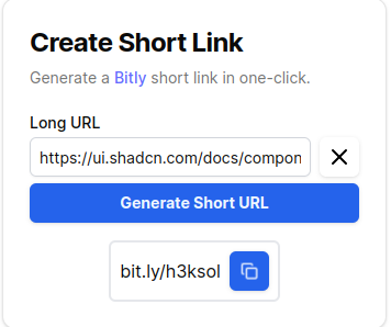
- Card: We'll start with Shadcn’s Card component which I've modified with a little help from v0.
Toggle to view the Card component
import { Button } from "@/components/ui/button"
import {
  Card,
  CardContent,
  CardDescription,
  CardHeader,
  CardTitle,
} from "@/components/ui/card"
import { Input } from "@/components/ui/input"
import { Label } from "@/components/ui/label"

export default function Popup() {
  return (
    <Card className="w-[350px]">
      <CardHeader>
        <CardTitle className="font-bold text-2xl">Create Short Link</CardTitle>
        <CardDescription>Generate a <a href="https://bitly.com" target="_blank">Bitly</a> short link in one-click.</CardDescription>
      </CardHeader>
      <CardContent>
        <div className="space-y-4">
          <div className="flex flex-col space-y-1.5">
            <Label htmlFor="name">Long URL</Label>
            <Input defaultValue="https://ui.shadcn.com/docs/components/carousel/"/>
            <Button className="w-full font-bold" variant="custom" >Generate Short URL</Button>
          </div>
        </div>
      </CardContent>
    </Card>
 )
}
- Install
Input,Label,Card, andButtonfrom Shadcn:
npx shadcn@latest add input label card button
- Replace the return value of the main App Component with
<Popup/>:
  export default function App() {
  return <Popup/>
  }
You can comment out the former code for now, we’ll use it later. See the Resulting UI:

- Add a
CopyButtoncomponent that will contain the resulting short URL
View <CopyButton/> - app.tsx
export function CopyButton({ text = "Hello, world!" }: { text?: string }) {
  return (
    <div className="max-w-sm mx-auto space-y-2">
      <div className="flex items-center space-x-2 bg-secondary p-2 rounded-md border-2">
        <span className="text-secondary-foreground flex-grow " aria-label="Text to copy">
          {text}
        </span>
      </div>
    </div>
  )
}
- Update the
Popupcomponent to include the new addition.
View <Popup/> - app.tsx
export default function Popup() {
// Dummy Text for Testing
  const text = "bit.ly/h3ksol"
  //...
					  <Button className="w-full font-bold" variant="custom" >Generate Short URL</Button>
          </div>
          <div className="flex flex-col space-y-1.5">
            <CopyButton text={text}/>
          </div>
         </div>
      </CardContent>
    </Card>
  )
}
See Result

That provides a basic UI for our simple link shortener.
Upgrade Popup Component UI
We want our extension to be very easy to use and provide a seamless user experience.
- Clearable Input Field
We’ll add a newClearableInputcomponent that includes a button that enables one-click clearing of the input field.
View <ClearableInput/> - app.tsx
export function ClearableInput({ defaultValue }: {defaultValue: string}) {
   const [inputValue, setInputValue] = useState(defaultValue);

  // Function to handle input changes
  const handleInputChange = (e: any) => {
    setInputValue(e.target.value);
  };

  // Function to clear the input field
  const handleClear = () => {
    setInputValue("");
  };

  return (
    <div className="space-y-2">
      <div className="flex items-center space-x-2">
        <Input
          type="text"
          value={inputValue}
          onChange={handleInputChange}
          className="p-2 border border-gray-300 rounded-md w-full"
        />
        <Button
          onClick={handleClear}
          variant="custom"
          size="icon"
          aria-label="Clear input"
          className="relative bg-transparent border-0 text-black hover:text-white"
        >
          <X className=" size-6 fixed z-20 "/>
        </Button>
      </div>
    </div>
  );
}
See Result

- Copy Button
We’ll upgrade theCopyButtonto include a one-click copy button and improve user experience.
View <CopyButton/>- app.tsx
export function CopyButton({ text = "Hello, world!" }: { text?: string }) {
  const [isCopied, setIsCopied] = useState(false)

  const handleCopy = async () => {
    if (!navigator.clipboard) {
      console.error('Clipboard API not supported by this browser');
      return;
    }

    try {
      await navigator.clipboard.writeText(text);
      setIsCopied(true);
      setTimeout(() => setIsCopied(false), 2000);
    } catch (err) {
      console.error('Failed to copy text: ', err);
    }
  }

  return (
    <div className="max-w-sm mx-auto space-y-2">
      <div className="flex items-center space-x-2 bg-secondary p-2 rounded-md border-2">
        <span className="text-secondary-foreground flex-grow " aria-label="Text to copy">
          {text}
        </span>
        <Button
          onClick={handleCopy}
          aria-label={isCopied ? "Text copied" : "Copy text"}
          variant="custom"
          size="icon"
          className="relative bg-blue-600"
        >
          {isCopied ? <Check className="h-4 w-4 fixed z-20 text-green-300" /> : <Copy className="h-4 w-4 fixed z-20 text-white" />}
        </Button>
      </div>
    </div>
  )
}
- Final Result
Problem
At this point, I could no longer tolerate the fact that my
prettier-eslint extension hadn’t been functioning. So I went to their docs and fixed it using the solution below(after troubleshooting):View Solution
- Install Dependencies(Typescript):
npm i -D prettier@^3.1.0 eslint@^8.52.0 prettier-eslint@^16.1.2 @typescript-eslint/parser@^5.0.1 typescript@^4.4.4
- Reload Vscode(shortcut - CTRL + R)
If you prefer prettier & eslint standalone. Visit here.
Bitly API using Access Token in Env
- Create a
.env.localfile in the root directory and add your bitly access token prefixed with VITE:

- Add a
shortenUrlfunction to interact with Bitly’s API.
View shortenUrl() - app.tsx
Although insecure, we expose the Bitly Token to the front end with the highlighted line of code.
Warning: Do not do this in “Production Code”!!! This is solely for the sake of learning/practice.
const shortenUrl = async (longUrl: string) => {
  const token = import.meta.env.VITE_BITLY_TOKEN;

  const response = await fetch("https://api-ssl.bitly.com/v4/shorten", {
    method: "POST",
    headers: {
      Authorization: `Bearer ${token}`,
      "Content-Type": "application/json",
    },
    body: JSON.stringify({
      long_url: longUrl,
    }),
  });
  const data = await response.json();
  console.log(data);
  console.log("Shortened URL:", data.link);
  return data.link.replace("https://", "");
};
The code will retrieve the token which will be used to retrieve a short link via Bitly’s API. Afterwards, the new link is returned to be displayed to the user.
- With a glance at the current UI( Final Result), you may be able to tell that the
ClearableInputandButtonin thePopupcomponent both need to access the state of the long URL. ClearableInput: It displays the long URL to the user and allows them to update it either by typing in or simply deleting the contents via theclearbutton. To accomplish this, it needs to access the long URL’sstateas well as itssetStatefunction.Button: This button generates the short URL based on the long URL'sstate.
Therefore, it may be best to lift the state into a separate component called
UrlHandler. Its purpose would be to create, manage and share the state management among the children components.View <URLHandler/>- app.tsx
The
state for the long URL is set up here and passed down to child components.function UrlHandler({ setShortUrl, }: { setShortUrl: Dispatch<React.SetStateAction<string>>; }) { const defaultVal = "https://ui.shadcn.com/docs/components/carousel"; const [longUrl, setLongUrl] = useState(defaultVal); const handleShortUrl = async (longUrl: string) => { const shortUrl = await shortenUrl(longUrl); setShortUrl(shortUrl); }; return ( <div className="flex flex-col space-y-1.5"> <Label htmlFor="name">Long URL</Label> <ClearableInput inputVal={longUrl} setInputVal={setLongUrl} /> <Button className="w-full font-bold" variant="custom" onClick={() => handleShortUrl(longUrl)} > Generate Short URL </Button> </div> ); }
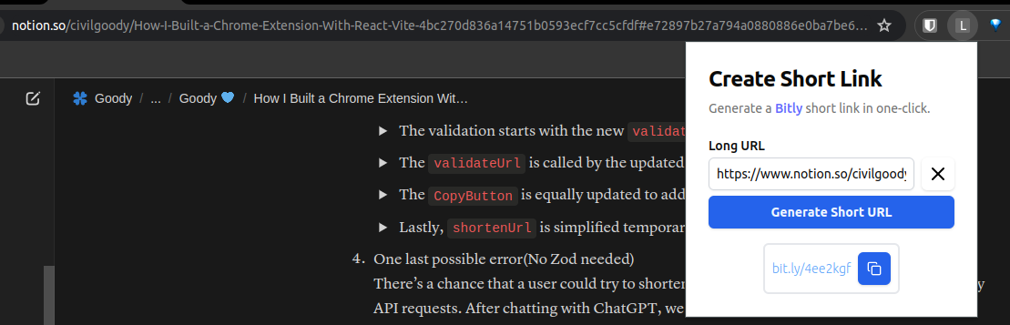
View updated <Popup/> - app.tsx
The
ClearableInput and Button (that generates the short URL) have now been removed.export default function Popup() { const text = "bit.ly/4ee2kgf"; const [shortUrl, setShortUrl] = useState(text); return ( <Card className="rounded-none"> <CardHeader> <CardTitle className="font-bold text-2xl">Create Short Link</CardTitle> <CardDescription> Generate a{" "} <a href="https://bitly.com" target="_blank"> Bitly </a>{" "} short link in one-click. </CardDescription> </CardHeader> <CardContent> <div className="space-y-4"> <UrlHandler setShortUrl={setShortUrl} /> <div className="flex flex-col space-y-1.5"> <CopyButton text={shortUrl} /> </div> </div> </CardContent> </Card> ); }
View updated <ClearableInput/> - app.tsx
Now,
inputVal and setInputVal are passed to it to manage the state of the long URL.export function ClearableInput({ inputVal, setInputVal, }: { inputVal: string; setInputVal: Dispatch<React.SetStateAction<string>>; }) { // Function to handle input changes const handleInputChange = (e: any) => { setInputVal(e.target.value); }; // Function to clear the input field const handleClear = () => { setInputVal(""); }; return ( <div className="space-y-2"> <div className="flex items-center space-x-2"> <Input type="text" value={inputVal} onChange={handleInputChange} className="p-2 border border-gray-300 rounded-md w-full" /> <Button onClick={handleClear} variant="custom" size="icon" aria-label="Clear input" className="relative bg-transparent border-0 text-black hover:text-white" > <X className=" size-6 fixed z-20 " /> </Button> </div> </div> ); }
Error handling(Zod) & File Organisation
Now flies in General Zod 😎. The most principled supervillain fighting against citizen mistakes.
Currently, if a user chooses to type in “zod”. It will get shortened, we don’t want that.
A brief visit to the Zod documentation shows a quick example to get you up to speed.
See here
import { z } from "zod";

// creating a schema for strings
const mySchema = z.string();

// parsing
mySchema.parse("tuna"); // => "tuna"
mySchema.parse(12); // => throws ZodError

// "safe" parsing (doesn't throw error if validation fails)
mySchema.safeParse("tuna"); // => { success: true; data: "tuna" }
mySchema.safeParse(12); // => { success: false; error: ZodError }
Note: In this section, we also reorganised our files, moving each component to its own file in the
src/components folder and moving all functions to src/lib/utils.ts.Here’s how we proceed:
- Create a URL validator and Error Component(to be used later):
View validateUrl() and <Error/> .
export function validateUrl(url: string) {
  const urlSchema = z
    .string()
    .url()
    .startsWith("https://", { message: "Invalid/Insecure URL" });
  const res = urlSchema.safeParse(url);
  return res.success ? res.data : res.error.format()._errors[0];
}
export function Error({ text }: { text: string }) {
  return <p className="text-red-500 font-bold">{text + "!"}</p>;
}
For more info about error handling with Zod, Visit here.
- To test it, we will simply make use of the
shortenUrlfunction.
View shortenUrl()
const shortenUrl = async (longUrl: string) => {
  const token = import.meta.env.VITE_BITLY_TOKEN;
  const res = validateUrl(longUrl);
  console.log(res);
  return longUrl === res ? "Success!" : <Error text={res} />;
//..
}
View Result


- Blend the validation back into the main codebase.
This took some time as a good number of modifications were necessary. I started by moving all components to their files as things were getting clunky. Up till this point, all the components and functions were in a single file -
popup.tsx.The validation starts with the new validateUrl() function, now in the utils.ts file.
Summary: Validate that the text is indeed a valid URL.
export function validateUrl(url: string) {
  const urlSchema = z
    .string()
    .url()
    .startsWith("https://", { message: "Invalid/Insecure URL" });
  try {
    const res = urlSchema.parse(url);
    return res;
  } catch (err: any) {
    if (err instanceof z.ZodError) {
      throw new Error(err.format()._errors[0]);
    }
    throw new Error("Something went wrong");
  }
}
The validateUrl() is called by the updated <URLHandler/> - handleShortUrl().
The error thrown by
validateUrl is caught and set as the shortUrl since we display errors in the same container.export default function UrlHandler({ setShortUrl, }: { setShortUrl: Dispatch<React.SetStateAction<TShortUrl>>; }) { const defaultVal = "https://ui.shadcn.com/docs/components/carousel"; const [longUrl, setLongUrl] = useState(defaultVal); const handleShortUrl = async (longUrl: string) => { try { const res = validateUrl(longUrl); const shortUrlString = await shortenUrl(res); setShortUrl({ text: shortUrlString, success: true }); } catch (err: any) { setShortUrl({ text: err.message as string, success: false }); } }; return ( <div className="flex flex-col space-y-1.5"> <Label htmlFor="name">Long URL</Label> <ClearableInput inputVal={longUrl} setInputVal={setLongUrl} /> <Button className="w-full font-bold" variant="custom" onClick={() => handleShortUrl(longUrl)} > Generate Short URL </Button> </div> ); }
The <CopyButton/> is equally updated to address the new changes.
Two new components are added to differentiate
Success from Error .import { Check, Copy } from "lucide-react"; import { useState } from "react"; import { Button } from "./ui/button"; type TShortUrl = { text: string; success: boolean }; export default function CopyButton({ text, success }: TShortUrl) { const [isCopied, setIsCopied] = useState(false); const handleCopy = async () => { if (!navigator.clipboard) { console.error("Clipboard API not supported by this browser"); return; } try { await navigator.clipboard.writeText(text); setIsCopied(true); setTimeout(() => setIsCopied(false), 2000); } catch (err) { console.error("Failed to copy text: ", err); } }; return ( <div className="mx-auto space-y-2"> <div className="flex items-center space-x-2 bg-secondary p-2 rounded-md border-2"> <span className="text-secondary-foreground flex-grow " aria-label="Text to copy" > {success ? <Success text={text} /> : <Error text={text} />} </span> <Button onClick={handleCopy} aria-label={isCopied ? "Text copied" : "Copy text"} variant="custom" size="icon" className="relative bg-blue-600" > {isCopied ? ( <Check className="h-4 w-4 fixed z-20 text-green-300" /> ) : ( <Copy className="h-4 w-4 fixed z-20 text-white" /> )} </Button> </div> </div> ); } function Success({ text }: { text: string }) { return <p className="text-blue-400 font-light text-sm">{text}</p>; } export function Error({ text }: { text: string }) { return <p className="text-red-500 font-bold">{text + "!"}</p>; }
Lastly, shortenUrl() is simplified temporarily(Disconnect the Bitly API).
export const shortenUrl = async (longUrl: string) => {
  return "bit.ly/jlo22";
  // ...
  }
- One last possible error(No Zod needed)
There’s a chance that a user could try to shorten the same URL. This would cost unnecessary API requests. After chatting with ChatGPT, we got this solution:
Using Local Storage
To avoid updating imports for now, we simply return the result of the new function from the original
shortenUrl function.function shortenURLBrowser(longURL: string) { const shortenedURLs = JSON.parse( localStorage.getItem("shortenedURLs") || "{}" ); if (shortenedURLs[longURL]) { console.log("This URL has already been shortened:", shortenedURLs[longURL]); return shortenedURLs[longURL]; } else { const randomString = genRandString(); const shortURL = `bit.ly/${randomString}`; // Save the new shortened URL shortenedURLs[longURL] = shortURL; localStorage.setItem("shortenedURLs", JSON.stringify(shortenedURLs)); console.log("URL shortened successfully:", shortURL); return shortURL; } } export const shortenUrl = async (longUrl: string) => { return shortenURLBrowser(longUrl); //... }
The Return of the Chrome API
Finally, The Chrome API makes its return. It’s quite simple to integrate it back into the current flow.
View Updated <URLHandler/>
The
useEffect Hook now updates the state of the input field based on the current tab.import { Dispatch, useState, useEffect } from "react"; import { Label } from "./ui/label"; import ClearableInput from "./clearable-input"; import { Button } from "./ui/button"; import { TShortUrl } from "@/lib/types"; import { shortenUrl, validateUrl } from "@/lib/utils"; const defaultVal = "https://ui.shadcn.com/docs/components/carousel"; async function getCurrentTabUrl() { const queryOptions = { active: true, lastFocusedWindow: true }; const tabs = await chrome.tabs.query(queryOptions); return tabs[0]?.url ?? defaultVal; } export default function UrlHandler({ setShortUrl, }: { setShortUrl: Dispatch<React.SetStateAction<TShortUrl>>; }) { const [longUrl, setLongUrl] = useState(defaultVal); useEffect(() => { const fetchUrl = async () => { const url = await getCurrentTabUrl(); // Fetch the current tab URL setLongUrl(url); }; fetchUrl(); }, []); const handleShortUrl = async (longUrl: string) => { try { const res = validateUrl(longUrl); const shortUrlString = await shortenUrl(res); setShortUrl({ text: shortUrlString, success: true }); } catch (err: any) { setShortUrl({ text: err.message as string, success: false }); } }; return ( <div className="flex flex-col space-y-1.5"> <Label htmlFor="name">Long URL</Label> <ClearableInput inputVal={longUrl} setInputVal={setLongUrl} /> <Button className="w-full font-bold" variant="custom" onClick={() => handleShortUrl(longUrl)} > Generate Short URL </Button> </div> ); }
Now, we can finally load unpacked in the Extensions tab and see the magic unfold🤭.
Deployment
Wow!

Features
Go Back to the top.
1.Auto Copy current tab URL!!!
2.Clear Input Field button!!!
3.Copy Bitly link to clipboard!!!

Related Posts


 Made with Bullet